everybody had to take art classes in don bosco but not everyone got assigned to recreate stampitas (or holy cards) as posters. in 4th grade i learned the grid enlarging technique from my brother dodi and since then i've been usually tasked to do the scaled up posters of stampitas. from these 'assignments' a collection of sorts grew. and also whenever you participate in any oratorical blah you get these stampitas as well. yup i also oratoricaled myself quite a lot so i got a lot of them stampitas. anyway, decades later as a project for my post grad in surrey institute of art and design i deconstructed these stampitas for my iconography design concentration. catholic kitsch for atheistically-inclined brits but it resonated with the irish. they're like religious kanji to anyone who wishes religious instruction but were not educated properly with scripture. but it worked almost like propaganda because they are small and can be handed out like leaflets.
i think i sent these to an exhibit somewhere north. i have tons of work like these. will try to dig them up.
archi+type
musings on identity, architecture, typefaces and design
Thursday, May 19, 2011
Tuesday, May 3, 2011
heaven's underbelly
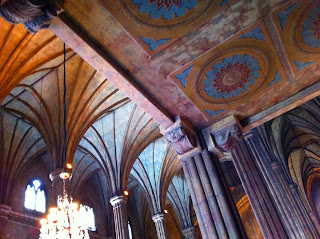
the metal interior of the basilica minore de san sebastian in quiapo is rusty and corroding, very ripe for metaphorical undertones regarding the country's catholic core, but as a current photographic image (iphone hdr settings), it is very magnificent in a syfy mashup of aliens, blade runner, and the abyss. clearly this gothic structure could be a cinematographer's dream project. but to truly align the socio-cultural representation with the basilica's current state of neglect would invite fractured opinions on every subject matter that intersects identity(architecture) and faith. so let's stick to the surface but attempts to romanticize should not be dismissed.
what is really heart-breaking is the lack of funding for a restoration but i wonder if the original state would be this fascinating. red sores on metal rib cage pillars. darkened frescoes that bellow dust. james cameron might like this.
ignoring the wedding ceremony that required my attendance in the basilica on a very hot and windy hot monday afternoon, my eyes wonder about the ceiling of dust-fumed frescoes like matrix's ship the nebuchadnezzar. or hovering about fire coral on a dive trip. solemn, awe-inspiring yet distressing. here are some of the pics:
With the chandelier lights turned on the decay is vivid. beautiful!
After the ceremony, with the lights turned off but the doors still open for ambient light, it feels and looks like a healing blister.
Very nice. it is like faith has worn us out. then there are the attempts to upgrade: cheap gloss over paint like make-up on a malate whore. plastic electric fans and fluorescent lighting are third-worldly parasitical. heritage laid to waste. still it is very cinematic in its decay. very deserving of a sequel post.
Tuesday, April 5, 2011
Friday, March 18, 2011
underconstruction: TWO E-CENTER
last last year, the company (will disclose in future posts) of my employ brought the company to beijing. the archi/design expresssion of the chinese has of course has gone beyond the sunday TV spectacle. one of the more notable structures is rem koolhass' CCTV tower which the building below evidently is, ummm, something of a local attempt.
Wednesday, March 16, 2011
Tuesday, March 1, 2011
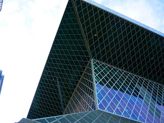
Back Space02: too cool for koolhaas. the seattle public library
i will google soon why this building is designed this way. i didn't bother finding out when i was there. wasn't in a meta-mood. (do research in library about the library?----ugh, no)
still uber-cool though, this library. will try to find my files of the interiors.
Thursday, December 16, 2010
backspace01: seattle squares
last march (or was it feb?), on my last day in washington state, i went around the belltown area of downtown seattle. i loved the geometric patterns on the facade of apartment buildings. the area is nice and small and i think it just covers about a 6x6 block grid. i wonder if flannel is the inspiration for this area.
Subscribe to:
Comments (Atom)


